


What exactly is the color wheel, and how does it help us?
Do you remember counting the colors of the rainbow as a child? Every time it rained, I waited for the rainbow to come and counted the amount of colors to ensure that none were missed. During my school days, this rainbow with its amazing colors appeared in books in the form of a color circle, and I gradually learned that all the colors that are visible and that we can see with our eyes are these colors. As a result, this color circle is known as a color wheel, and it is arranged in the order of frequency.
The color wheel is so useful and important that it is visible everywhere. If you love photography and work with graphics software; You must be very familiar with this popular color range. If, like me, you are a fan of interior design and furnish your home according to the principles and rules of interior design, then you should spend a lot of time on this color wheel.
The main colors in the color wheel

In the color wheel, red, yellow and blue are the main and primary colors. No other colors were used in the original composition of these colors and cannot be created by mixing other colors. In other words, primary colors are among the purest colors, and by combining these three colors, we can create the colors found in nature.
Secondary colors in the color wheel
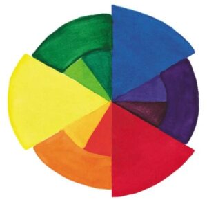
Secondary colors can be defined as follows: Secondary colors are obtained by mixing equal amounts of two primary colors.
On the color wheel, purple, green, and orange are among the secondary colors, and those colors are located between the two primary colors on the color wheel.
- Purple (red+blue)
- Green (blue + yellow)
- Orange (red+yellow)
Mixed colors on the color wheel
Tertiary colors, often known as composite colors, are created by combining primary and secondary colors. They are situated between the two hues that comprise it.
It’s interesting to note that this combination produces six hues, giving us a total of 12 options. The following colors are mixed:
- Yellow orange (yellow + orange)
- Orange-red (orange + red)
- Red purple (red + purple)
- Blue violet (purple + blue)
- Blue-green (blue + green)
- Green yellow (green + yellow)
The essential to remember is that while mixing colors, their ratio must also be considered in order to achieve the desired color.
Complementary colors of the color wheel
Each secondary color complements the primary colors in such a way that they complete one another.
In the color wheel, these hues are opposite each other. In general, the mixture of main and secondary colors results in gray, which is a neutral color.
Two complementary colors, on the other hand, result in more shine, as seen in nature. For example, red, the primary color, complements green, one of the secondary colors. Blue and orange are complementary colors that are popular.
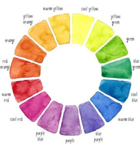
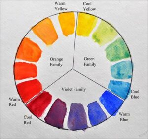
Colors similar to the color spectrum
When two colors are next to each other on the color wheel, they create a harmonious space. Consider the color yellow as an example. It creates a stunning spectrum of warm colors that eventually reaches red. The color wheel in the image below displays the color spectrum.
Active and passive colors
There are various active and passive colors on the color wheel.
Warm colors like red, yellow, and orange belong to the category of active colors. These hues are incredibly dynamic and adaptable.
They are entirely visible when positioned next to passive colors. According to popular belief, passive colors are more neutral and paler than active colors. These colors, which include green, blue, and purple, fall under the category of “cold colors” and have a calming effect on people.
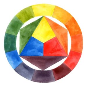
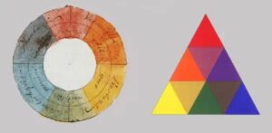
Color relationships
Colors can be shown in a color triangle or a color wheel.
The colors that are placed in the corners of an isosceles or equilateral triangle on the color wheel are those that are used the most and are among the first colors that we teach our children.
These shades of red, blue, and yellow are their primary colors.
Color wheel of printers
Another cycle of colors used in printers is represented in the color triangle. These hues are made up of three different colors that are employed in the printing process: red, turquoise blue, and yellow. New colors are formed by combining these three hues, which must be combined in a balanced manner so that those who conduct printing and design work obtain the best graphic outcome.
Goethe’s color wheel
The hues of Goethe’s color triangle are primary, secondary, and neutral. However, neutral colors are hues that do not exist on the color wheel and are created by combining primary and secondary colors with a very low quantity.
You can create more harmony in your home décor now that you are familiar with the color cycle and their combinations.
Always remember the color wheel
We went over the color wheel and the rules of color pairing in great depth. If you want to use colors more professionally as a designer, you should learn more about the color wheel and the principles for combining them than I did above. In truth, this essay is merely an introduction to color laws; depending on your field of work, you should immerse yourself in the world of colors so that you can develop your own work by combining the proper colors.